- add remove
- add remove
- Fashion design
- Are you looking for spare parts?
-
For other brands, spare parts, when available are displayed directly on the product page. If you can't find the spare part you need, contact us.
- Heading title
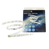 Lampo Strip LED 5050 60led/m 24V 14.4W/mt Reel 5M 72W Light color tone-3000°K WARM LIGHT, Version-IP20 For IndoorCHF42.68 CHF25.61
- On sale!
- -40%
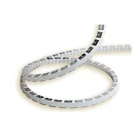 Alcapower Strip LED Snake Flex profile 11W/m 220V IP65 Dimmable Light color tone-3000°K WARM LIGHT, Lunghezza-5 metersCHF128.71 CHF90.09
- On sale!
- -30%
- add remove
- add remove
- add remove
Living Room
Kitchen
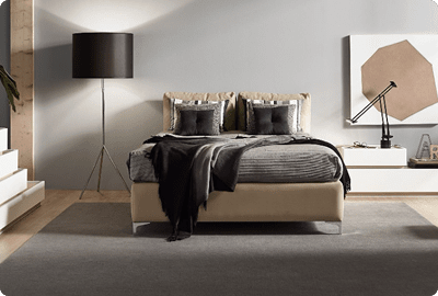
Bedroom

Office
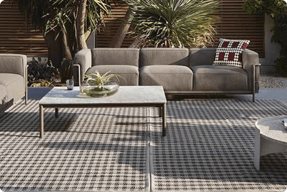
Outdoor


- There are no more items in your cart
- Shipping
- Total CHF0.00
- add remove
- add remove
- Fashion design
- Are you looking for spare parts?
-
For other brands, spare parts, when available are displayed directly on the product page. If you can't find the spare part you need, contact us.
- Heading title Lampo Strip LED 5050 60led/m 24V 14.4W/mt Reel 5M 72W Light color tone-3000°K WARM LIGHT, Version-IP20 For IndoorCHF42.68 CHF25.61
- On sale!
- -40%
Alcapower Strip LED Snake Flex profile 11W/m 220V IP65 Dimmable Light color tone-3000°K WARM LIGHT, Lunghezza-5 metersCHF128.71 CHF90.09- On sale!
- -30%
- add remove
- add remove
- add remove
-
Living Room
-
Kitchen
-
Bedroom
-
Office
-
Outdoor
The color of light and the color of objects: how to choose furniture and lamps
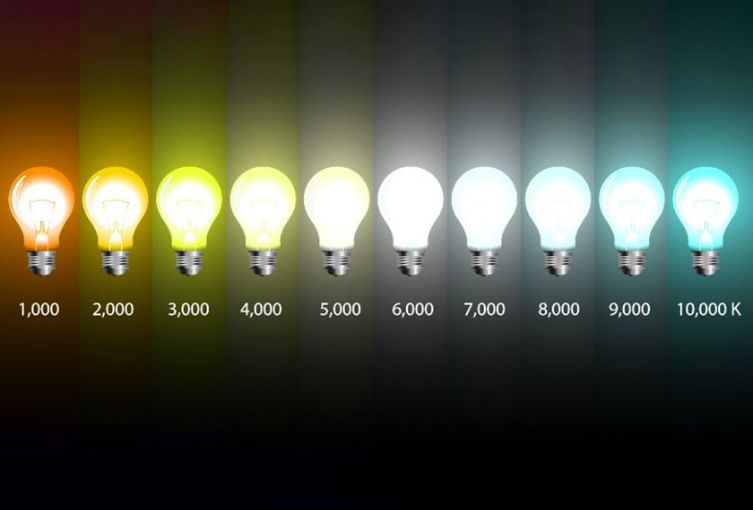
Light is never neutral; each light source has its own color temperature, hue, and intensity that profoundly influence the perception of spaces and the objects within them. A red armchair, under the warm light of an incandescent bulb, appears enveloping and soft; the same armchair, illuminated by a cold LED, takes on a brighter, almost aggressive tone.
The relationship between light and the color of objects
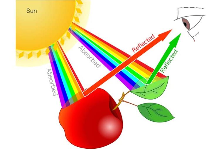
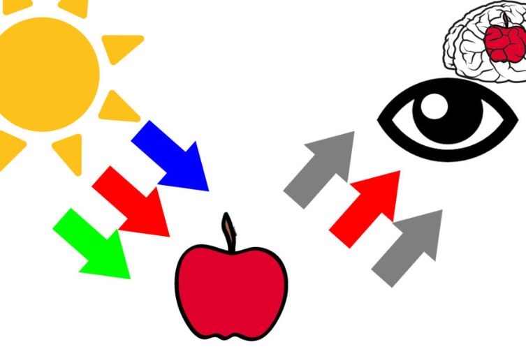
The color we perceive does not actually belong to the object itself, but is the result of the light striking it and being reflected toward our eyes. A blue chair, for instance, absorbs the wavelengths of all visible colors except for blue, which is reflected. This means that the way we see colors depends as much on the characteristics of the object as on the nature of the light that illuminates it.
When designing a home or workspace, this delicate balance cannot be ignored.
A wall painted sage green will look warmer and more velvety under a warm light (around 2700K), while it will appear cooler and more subdued under neutral or cool light (4000K and above). The final effect is therefore a dance between pigment and illumination, between matter and waves of light.
Furniture and lamps: how to choose in chromatic harmony
A well-designed interior does not simply match furniture and colors that look good together aesthetically; it also takes into account the type of lighting that will define the space.
Lamps become not only functional elements but also true design tools capable of enhancing or softening the tones of furniture. Imagine a living room with natural shades—light wood and beige fabrics. Warm light will make the space cozy, evoking a sense of intimacy. If the same room is illuminated with neutral white light, color rendering will be more realistic and materials will reveal their authenticity, but the atmosphere will feel less soft. Conversely, if the furnishings play with strong contrasts, such as black and metal, cool light will emphasize the modern, bold character of the room, highlighting reflections and surfaces.
To maintain chromatic harmony, it’s helpful to remember that every lamp brings with it not only a color temperature but also a Color Rendering Index (CRI). The closer this value is to 100, the more faithfully colors are perceived, without distortion.
Choosing lamps with a high CRI is therefore essential in spaces where color details are important, such as kitchens, creative studios, or art galleries.
What determines the color of objects?
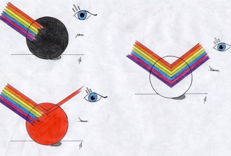
The color of objects is determined by the interaction between light and matter. When light strikes a surface, some wavelengths are absorbed while others are reflected. It is precisely these reflected wavelengths that reach our eyes and give rise to color perception. In other words, an object does not have an intrinsic color—it shows one only in relation to the light that illuminates it.
What are the colors of light?
Visible light can be broken down into different colors, ranging from red to violet. This is a continuous spectrum that includes red, orange, yellow, green, cyan, blue, and violet. Each corresponds to a different wavelength: red has longer, less energetic waves, while violet has much shorter, high-frequency ones.
Which light phenomenon gives color to objects?
The phenomenon responsible is selective reflection of light. When luminous radiation meets the surface of an object, the pigments or physical characteristics of the material determine which wavelengths are absorbed and which are reflected. Our visual system then translates these reflected waves into color perception.
Visible spectrum colors
The visible spectrum is the portion of the electromagnetic radiation that the human eye can perceive. It extends approximately from 380 to 750 nanometers. Within this range lie all the colors we know—from the warmest reds to the coolest violets.
Primary colors
In additive synthesis, used for light, the primary colors are red, green, and blue (RGB). Combined in various proportions, they generate all the other colors in the visible spectrum, including white. In subtractive synthesis, typical of pigments and paints, the primaries are cyan, magenta, and yellow (CMY).
Color Spectrum
The term “color spectrum” refers to the sequence of colors that appears when white light is broken down, as with a prism. This distribution clearly shows the continuity between shades, which have no fixed boundaries but flow seamlessly into one another.
Light Spectrum
The light spectrum does not only include the visible range but extends far beyond. At the edge of red lies infrared, invisible to the human eye but perceived as heat. On the other end, beyond violet, lies ultraviolet, invisible but highly energetic, responsible for effects such as tanning.
Complementary colors
Complementary colors are pairs that, when combined, cancel each other out, producing a neutral shade such as gray or white. In terms of light, the complement of red is cyan, the complement of green is magenta, and the complement of blue is yellow. Used together in interior design and lighting, they create strong yet balanced contrasts.
Violet Frequency
Violet occupies the most energetic part of the visible spectrum, with wavelengths between about 380 and 450 nanometers. This means its frequencies are among the highest perceivable by the human eye, giving this color a particular intensity often associated with mystery and depth.
Want to know more? Visit our website Diffusione Luce!
Written by Alice Pruccoli
Share this content